Wishpond
Data-Driven Decision Sparks 52% Growth in Visitor Numbers
With the rise of AI-driven technologies, Wishpond was presented with an opportunity to integrate AI into our platform to significantly streamline the website creation process for small and mid-sized businesses. Our challenge was how to implement this in a way that empowered users while maintaining a seamless experience.
In just a matter of weeks since the AI trend took off, we witnessed a rapid surge in the adoption and integration of AI across various markets. Countless products and software swiftly embraced this trend, incorporating AI into their offerings.
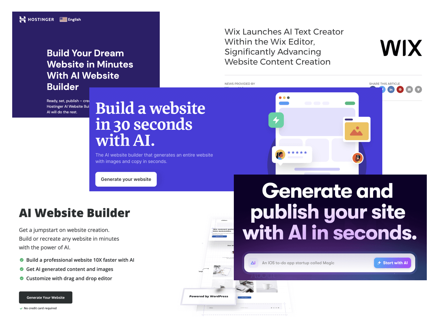
Research and technical constraints
Our research uncovered a common challenge among small to midsize business owners: creating high-quality website content and visuals. These business owners are often stretched thin, juggling multiple aspects of their operations, and they typically lack the time or expertise to design an effective website or craft compelling content.
This pain point made them ideal candidates for an AI-driven solution that could rapidly generate content and visuals, streamlining the website creation process. By offering generative AI capabilities, we could empower users to quickly build a professional online presence, allowing them to focus on what matters most—growing their business.
The generative AI model we were working with had limited customization options on the backend, requiring us to carefully design the user interface to accommodate these restrictions without overwhelming the user.
How I helped?
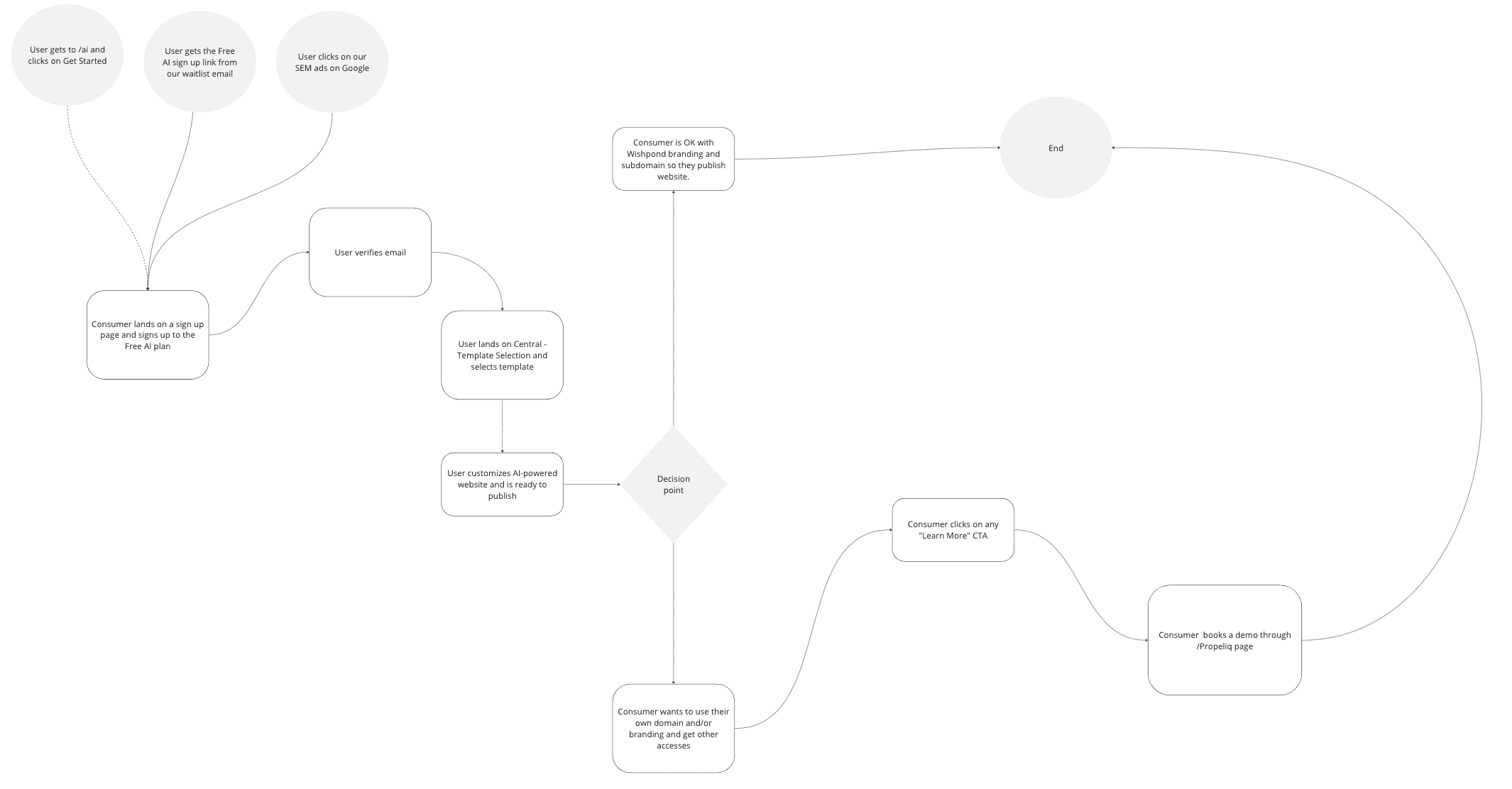
After we had a full understanding on the generative AI model and the technical constraints that come with it, we started to map out the user experience. For the project, we even included marketing team to strategize the best way to start this user experience, streamlined the steps in the meantime taking account the technical constraints. After countless of brainstorming meetings, we were able to come up with the first version of the user flow map.
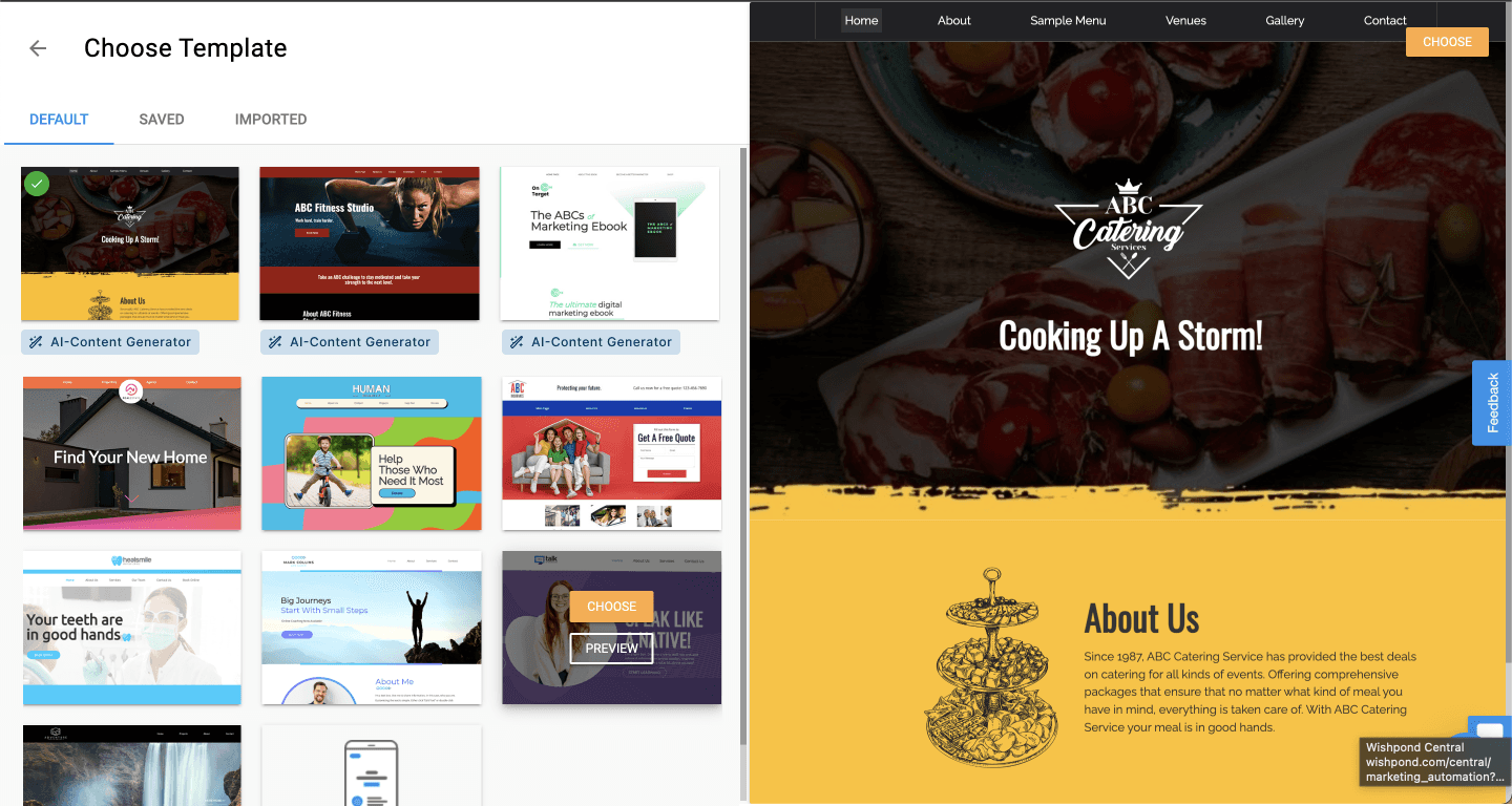
We introduced an 'AI-Content Generator' badge on templates that supported the AI feature. This allowed users to easily identify templates with AI capabilities without interrupting their flow, minimizing cognitive load and guiding them toward the most suitable choices.
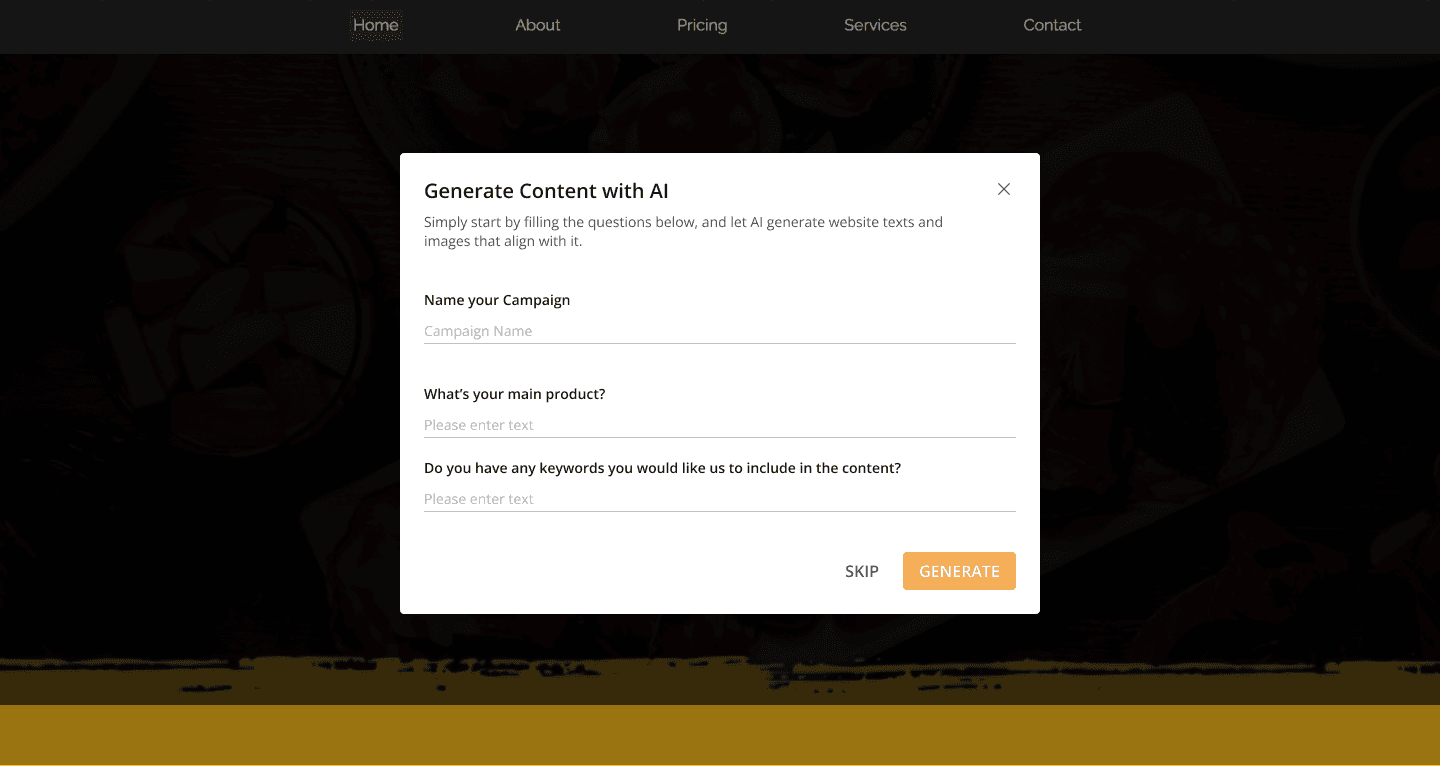
After the user selects a template, we introduced an additional step to gather user input for the AI prompts, ensuring a complete customization experience. To make this process seamless and user-friendly, I opted for a pop-up design solution. By implementing a pop-up, we maintain the flow of the user journey while allowing users to conveniently provide the necessary information. This design choice ensures a smooth and intuitive experience for users during the AI prompt completion phase.
Lastly, we introduced 4-5 subtle animations inspired by Uber Eats to indicate that the AI was working in the background. These animations not only entertained users but also reassured them that the AI was processing their request, reducing anxiety during the wait.
The results were dramatic:
After two months of dedicated work, we successfully launched the MVP, which yielded remarkable outcomes. With our new feature, users can now build a fully customized three-page website from scratch in an average time of just 60 seconds. Previously, this process could take anywhere between three to twelve weeks. This drastic reduction in design time showcases the effectiveness of our innovation.
Furthermore, the launch of our product proved to be a resounding success, as it generated an impressive average of over 150 leads per day during the initial weeks. This exceptional level of customer interest and engagement has further validated the value and appeal of our offering.
-
User Drop-off & Solution
One of the main problem we found, as you can see from the graphic, it reveals that out of the visitors who reached the sign-up phase, only 13.64% proceeded to the next step. This indicates a substantial loss of around 90% of potential users engaging with our new feature.
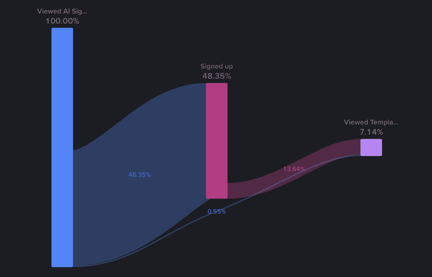
To address this problem, we started to talk with some users to gain insights into the barriers they encountered during this phase. In the meantime, we conducted extensive competitor research to explore alternative solutions that could enhance our user experience.
The approach
The visitors were expressing frustration upon discovering that signing up and going through the entire process was necessary to use our free AI website builder. To address this issue, these are some approaches we took.
Firstly, we decided to eliminate the sign-up step altogether, prioritizing the goal of enabling users to engage with our new feature as quickly as possible. By removing this barrier, we aimed to reduce user frustration and encourage immediate interaction.
Simultaneously, we streamlined the onboarding process into just two steps, incorporating straightforward questions to make it more user-friendly. Additionally, I made intentional design choices to enhance the overall experience which is to include interactive graphics alongside the process to engage users and make it a more delightful and less frustrating experience.
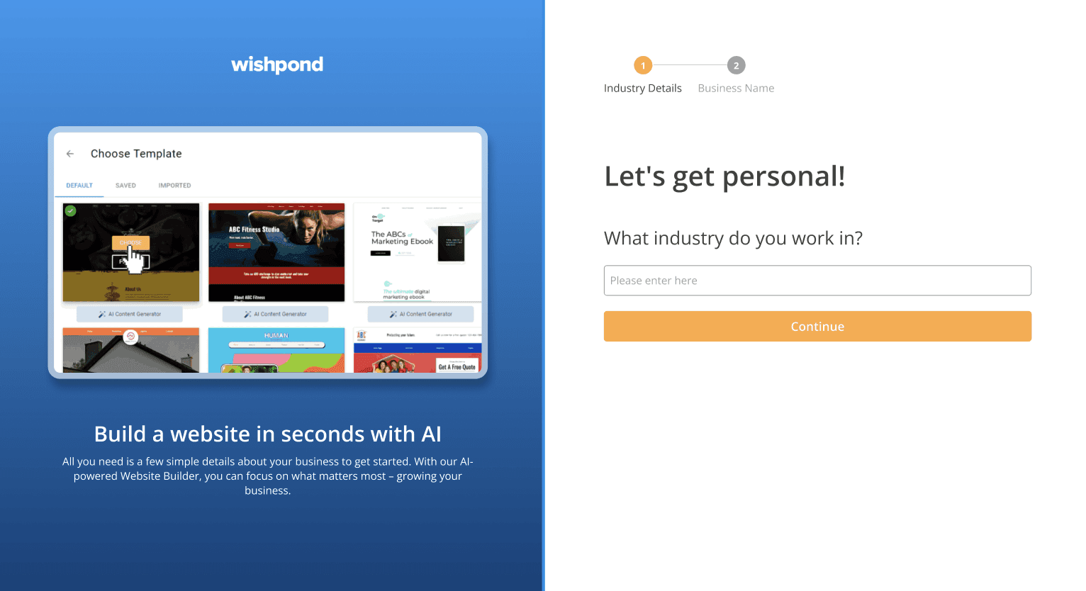
Substantial growth to 52% of visitors now actively engaging with it
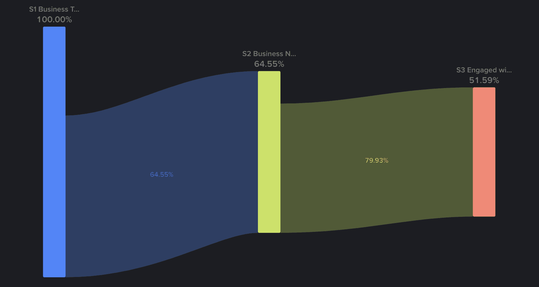
Following the implementation of our new solution, we observed a remarkable surge in the number of potential users engaging with our feature. Initially, only 7% of visitors successfully reached our feature, but we witnessed a substantial growth to 52% of visitors now actively engaging with it.
-
Conclusion/Takeaways
This project taught me the value of aligning design choices with user expectations while balancing technical constraints. By continuously iterating based on user feedback and behavior, we were able to significantly improve engagement and satisfaction.


